Growing Your Business 101
How large should your logo be to attract customers?
A big logo is often your worst enemy. If you want your brand to get noticed, try putting your logo last.
I know that may sound like the opposite of what you are trying to achieve when marketing your business, but this is one of the most important points that business owners tend to overlook. As a business owner, it is easy to confuse your logo with your brand. the fact is that the logo is NOT your brand. It represents your brand, but the logo itself is not the brand. This point is so important and yet so misunderstood, that we will devote several articles to illustrate key points you must understand in greater detail.
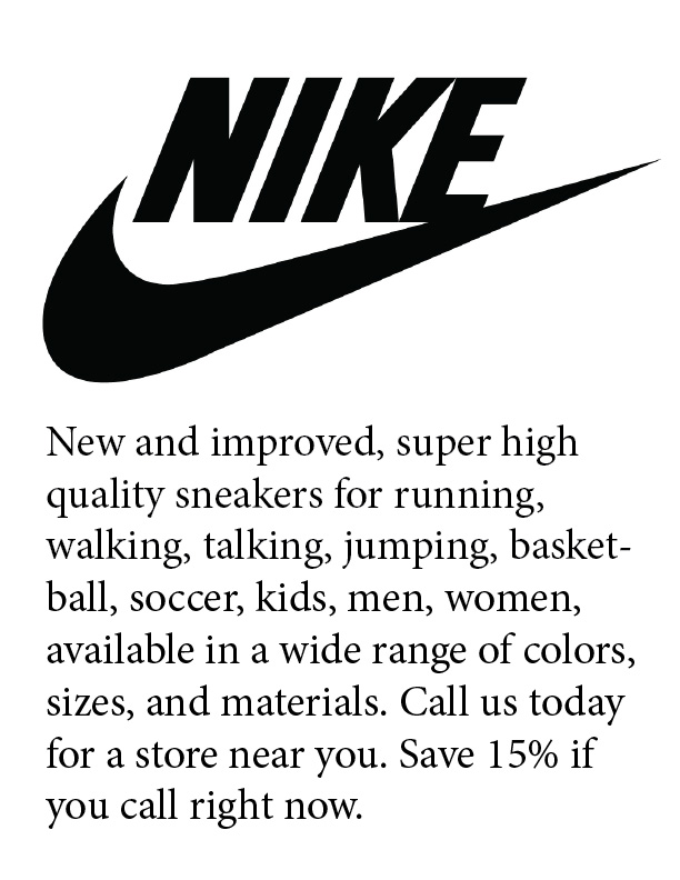
To help you see where I am going with this, I want you to try a simple exercise. Let’s say you are in the market for a new pair of sneakers. There are so many to choose from. Imagine you are reading a magazine and come across an ad for Nike. It is a one page ad with a huge Nike logo across the top half of the page, with a description of all the great features and types of shoes that they have available. Close your eyes for a minute and picture coming across such an ad in a magazine. Think about how much of an impact it will have on your feelings and desire to go out and buy a pair of Nike's, or any other shoes for that matter?

Do you think making the logo bigger will make you want to buy the shoes more? As a business owner, your first thought maybe "yes, the bigger the better", but I want you to think objectively for moment. What value does that logo have to "you" as the buyer of shoes. Do you think the logo means much on its own. Does the poorly written ad copy ad much value? Do you think if they listed more features, more options, more colors, it would make any difference. Would you even stop to look at such an ad, and even if you did, what are the chances you would remember it the next time you are at a store trying to decide between a Nike or Reebok pair?
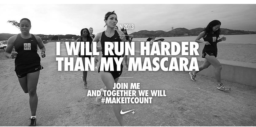
Now imagine again flipping thru a magazine, and coming across an ad that happens to have an image of someone doing something you wish you were doing. Possibly someone like yourself, but one who is out running and improving their health just like you have been meaning to do. The person in the ad makes you feel like “ you know what, I AM going to get up early and run this weekend. I AM going to make my health better. I can just feel it.” The ad makes you want to get up and do something because it connects with a feeling deep inside that you long for.

Oh, and by the way, in small print at the bottom, the Nike logo subtly lets you know who / what will make you feel like that. They just want you to know they understand how you are feeling and are there to help you meet your goals if you are ready to take control. Would that make you more likely to buy a pair of sneakers? Initially, your thought may be that it makes no difference, but give it some deep thought and you will see how this ad is a serious motivator for someone who may be on the fence about buying sneakers. It pushes you to get out of your seat and get out there. And what are you going to need when you finally get out there for a jog? .... you guessed it, sneakers. The ad connects with the true NEED of the viewer. It connects with the need to run, to be fit, to be healthy. Ten other products could do the same, but Nike is connecting your need for health and fitness with a desire for a better pair of sneakers. Infact, if you think about it, many of us will probably agree that we easily get led into believing that a better pair of sneakers will help us run better, help us jump higher, help us score more points, etc. Would you remember this ad vs. the previous? Could the feelings it leaves with you influence your buying decision when you are at a store and comparing different brands... which one appeals to your inner needs? In the end, it's not about the shoes-- it's about the benefit the shoes provide.
Now, I am not sure if this ad applies to you, but I think you will see the difference in the above 2 approaches. The second ad makes the connection with the audiences' emotions. It shows an understanding of what the viewer wants. It talks about what the viewer cares about. NOT the logo, not what Nike cares about. I can assure you they want to sell shoes, just as much as you want to sell your latest widget or service. But they don’t just come out say “buy Nike shoes”. The reason is not because they are stupid and wasting money running silly ads that don’t even show the shoes. It’s because they are brilliant and truly understand their target customers and how to sell to them.
And that is the point I want you to take away from this. It’s not about what you want as the business owner that matters. Nobody but you cares about your logo, and how you have improved your product 5 ways from the previous model. The customer ONLY cares about what they feel inside, what their needs are. Spend time to understand what your customer truly wants, and give them that. Connect with your customer’s needs. If you do that, they will read the fine print at the bottom of your page and find your logo and find you because they absolutely want to deal with you, they want to travel across great distances to find you because finally someone gets their pain, you understand what they need and they are overjoyed to have found you. And that connection, that feeling, that impression your viewer has of your company in their mind--- that is the brand......the logo is just the graphic that helps put an identity on that.
I realize that advertising is expensive. As a small business owner you think how much ad space is costing you and you want to slap the biggest logo you can in that space. RESIST that urge. You may notice your local competitors are putting huge logos in their ads and you are worried they will out do you. RESIST that urge. You want to use limited space to push you logo first and value second. RESIST that urge.
Notice how small the Nike logo is compared to the rest of the details. The details that matter to the viewer are big, the logo is not. This ad may have cost Nike more than many small businesses make in a year. Do you think they are thinking they wasted their money because the logo is barely visible? No. Because they know that a great ad appeals to the end user. Do not get peer pressured into following your competitors who may not understand the first thing about marketing. Think creatively, and follow proven marketing principles. That is how you build a great brand, not by making huge logos.
We'll try to talk more about this in future articles. Feel free to write in about your challenges and we will try to help.


